


In the beauty industry, packaging is something we look at. But increasingly, it is also something we touch, hold and explore with our fingertips.
Even before the formula is applied, physical contact with the pack is one of the first moments in which consumers engage directly with the product. A velvety surface, a raised detail, a distinctive geometry or a combination of different textures can turn an everyday gesture into a more recognizable and engaging experience.
This is where the tactile dimension of cosmetic packaging comes into play: not simply as an aesthetic detail, but as a tool through which design, functionality and brand identity can come together.
From visual design to tactile design
Color, silhouette and decoration remain essential elements in making a product instantly recognizable. But packaging design does not end with what we can see.
When we pick up a mascara, open a lipstick or use a gloss, we simultaneously perceive shape, weight, surface, texture and movement. These may seem like small details, but together they help shape the overall impression of the product.
This is why designing packaging increasingly means considering its tactile design as well.
Smooth or textured surfaces, Soft Touch finishes, three-dimensional details and raised decorations can add another layer to the project: the pack no longer communicates only through its visual appearance, but also through touch.
Embossed details as an expression of identity
Three-dimensionality can become an integral part of a brand’s visual language.
A raised element can highlight a logo, enhance a pattern or create contrast between different areas of the surface. In this way, even a seemingly simple graphic detail gains depth and becomes something that can also be perceived through touch.
Among Team Beauty’s customization options, raised printing makes it possible to work precisely in this direction: not simply decorating the packaging, but turning graphics into a tactile component.
Geometric patterns, lettering, iconic elements or distinctive brand details can emerge from the surface, helping create a more recognizable and distinctive pack.
The result is a customization that works on two levels at once: visual and sensory.
CP21 SWIRL: when the shape itself creates the tactile experience
The exploration of tactility can begin with decoration, but it can also be built directly into the structure of the packaging.
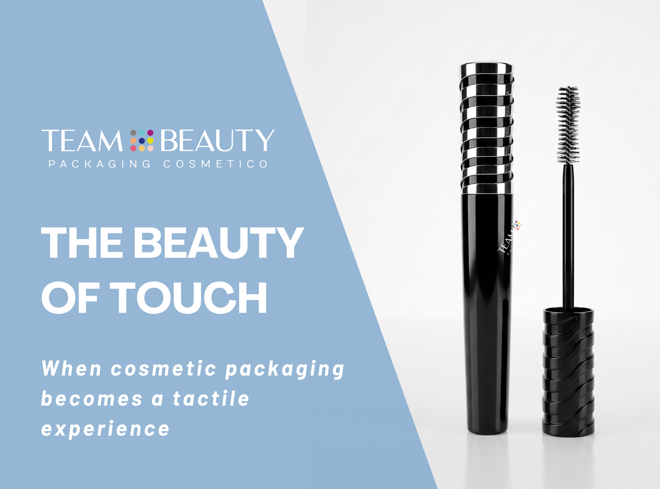
The new CP21 SWIRL was developed around this very idea. Its surface features a three-dimensional motif that spirals around the cap, creating a continuous interplay of volumes, raised elements and lines. The pattern changes the way the surface is perceived, making the packaging recognizable not only visually, but also through touch.
Its bold geometry introduces movement into an element that is traditionally linear, such as the cap, giving it a strongly distinctive character.
Paired with the FP21IS bottle, CP21 SWIRL also creates an interesting contrast between the clean silhouette of the body and the more structured surface of the cap. The result is a packaging solution in which three-dimensionality becomes an integral part of both the design and the user experience.
Designing a pack to be seen, touched and remembered
In beauty packaging, every surface is an opportunity to communicate something.
Solutions such as the new CP21 SWIRL, together with the possibilities offered by raised printing and different finishes, open up new opportunities for customization: packaging is no longer simply a surface to decorate, but an object to design in all its dimensions.
Want to find out more? Contact us